While many engaged Analysis #1 in my last post, only one engaged Analysis #2. So let me try again, this time with a graph.
This is about a simple model of prevention, one that assumes a constant elasticity (= power law) between harm and prevention effort. An elasticity of 1 means that 1% more effort cuts harm by 1%. For an elasticity of 2, then 1% more effort cuts harm by 2%, while for an elasticity of 0.5, 1% more effort cuts harm by 0.5%.
Such simple “reduced form” models are common in many fields, including economics. Yes of course the real situation is far more complex than this. Even so, reduced forms are typically decent approximations for at least small variations around a reference policy. As with all models, they are wrong, but can be useful.
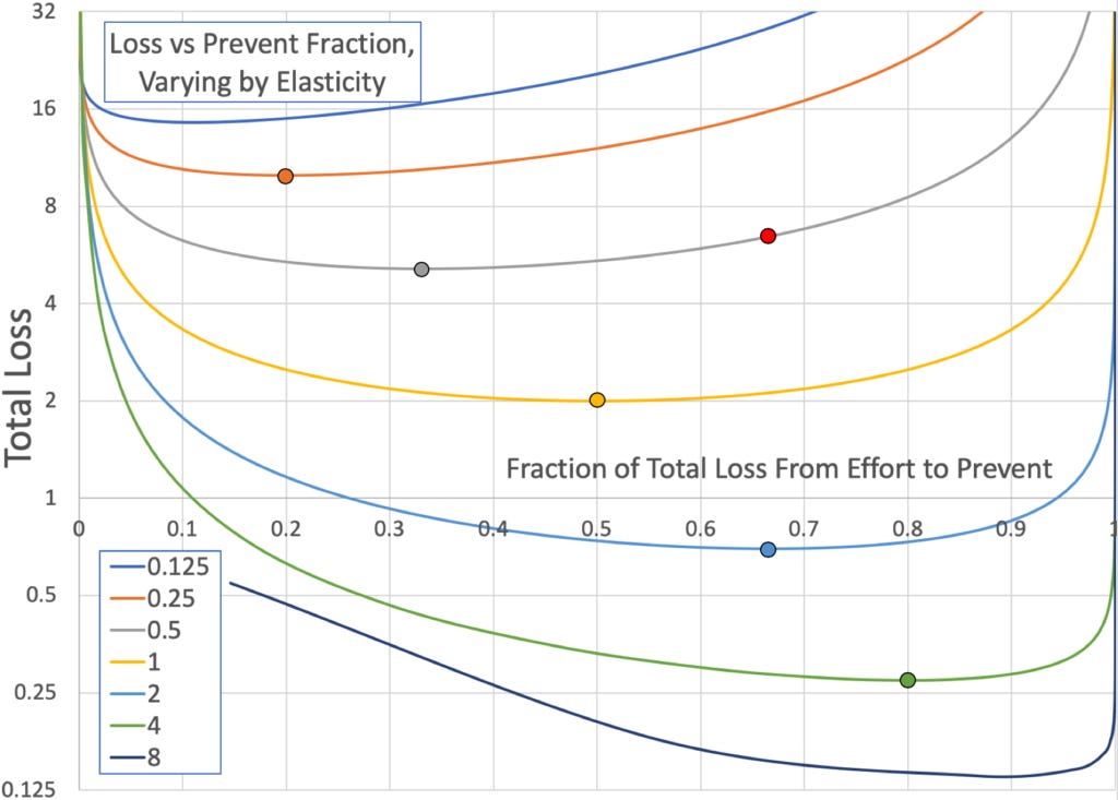
Each line in the following graph shows how total loss, i.e., the sum of harm and prevention effort, varies with the fraction of that loss coming from prevention. The different lines are for different elasticities, and the big dots which match the color of their lines show the optimum choice on each line to min total loss. (The lines all intersect at prevention = 1/20, harm = 20.)

As you can see, for min total loss you want to be on a line with higher elasticity, where prevention effort is more effective at cutting harm. And the more effective is prevention effort, then the more effort you want to put in, which will result in a larger fraction of the total harm coming from prevention effort.
So if locks are very effective at preventing theft, you may well pay a lot more for locks on than you ever suffer on average in theft. And in the US today, the elasticity of crime with respect to spending on police is ~0.3, explaining why we suffer ~3x more losses from crime than we spend on police to prevent crime.
Recently, I asked a few polls on using lockdown duration as a way to prevent pandemic deaths. In these polls, I asked directly for estimates of elasticity, and in this poll, I asked for estimates of the ratio of prevention to health harm loss. And here I asked if if the ratio is above one.
In the above graph there is a red dot on the 0.5 elasticity line. In the polls, 56% estimate that our position will be somewhere to the right of the red dot on the graph, while 58% estimate that we will be somewhere above that grey 0.5% elasticity line (with less elasticity). Which means they expect us to do too much lockdown.
Fortunately, the loss at that red dot is “only” 26% higher than at the min of the grey line. So if this pandemic hurts the US by ~$4T, the median poll respondent expects “only” an extra $1T lost due to extra lockdown. Whew.
Added 26May: Follow-up surveys on US find (via lognormal fit) median effort to harm ratio of 3.6, median elasticity of 0.23. For optimum these should be equal – so far more than optimal lockdown!
Added 1Aug: Repeating same questions now gives median effort to harm ratio of 4.0, median elasticity of 0.18. That is, they see the situation as even worse than they saw it before.
Added 22Oct: Repeating the questions now gives median effort to harm ratio of 5.2, median elasticity of 0.10. The estimated deviation between these two key numbers has continued to increase over time.


Actually my result is general, even without constant elastcitity: https://www.overcomingbias....
Sure the model can apply, and my personal guess is that the US spends too much, but I don't have elasticity estimates on this topic to use to apply this model.